Program Dashboard

UX-UI Design
2022
Redesign of a key feature for Mentorloop’s software, a world-class leading mentoring software provider

Involvement

As the sole UX/UI Designer, I led all phases from requirements gathering to the final developer handoff.

Overview and Goal

Mentoring programs connect mentors and mentees for growth, knowledge sharing, and networking. The Program Coordinator oversees the program's progress, ensures participant engagement, and facilitates effective mentor-mentee relationships. The goal of this project was to create a more usable and insightful dashboard for Program Coordinators, providing them with clear, actionable data and a more engaging user experience.

Design thinking approach

The project was guided by design thinking principles, ensuring a user-centred process that involved empathising with Program Coordinators, defining their key challenges, ideating potential solutions, prototyping the dashboard, and testing its. This approach led to an intuitive and impactful solution.

Image taken from www.ovtt.org
Note on Images: To protect client confidentiality and respect privacy, some images on this project are presented in lower quality. While the resolution may be reduced, the core concepts and design principles are accurately represented. Please feel free to reach out if you have any questions or need further clarification about this project.

Empathise

Understanding User and Business Needs

To design a dashboard that effectively meets the needs of Program Coordinators, we began by deeply understanding their challenges, goals, and interactions with the existing system. This phase involved stakeholder interviews, analysing key metrics, and mapping out the user journey.

Stakeholders interviews

Customer Success Team interviews

The project was guided by design thinking principles, ensuring a user-centred process that involved empathising with Program Coordinators, defining their key challenges, ideating potential solutions, prototyping the dashboard, and testing its. This approach enabled me to create a solution that was both intuitive and impactful. Key discoveries:

Besides the many resources available, Program Coordinators require reassurance that their program is progressing smoothly.

The many aspects of a mentoring program—such as inviting participants, matching, goal setting, and feedback—can sometimes feel overwhelming for coordinators.

Program Coordinators are under constant pressure to demonstrate their program’s success to other stakeholders.

There is a wide range of technical proficiency among Program Coordinators; while some are very technically savvy, others are not.

CEO and Product Manager interviews

I also interviewed the CEO and Product Manager to align the project with Mentorloop’s business goals and ensure the new dashboard reflected the company’s approach to mentoring. Key Discoveries:

Emphasising the human component in mentoring was crucial.

The dashboard needed to highlight Mentorloop’s best-in-class mentoring interface.

It was essential to create an engaging experience for Program Coordinators, with features that acknowledge their efforts and successes.

Metrics and Feedback

Relevant metrics were examined, and qualitative feedback from Program Coordinators through various sources like tickets, emails, and surveys was gathered. Key Findings:

Over 80% of Program Coordinators use Mentorloop on desktop.

22% of feedback highlighted the need for quick access to data, reinforcing interview findings.

19.5% of the feedback mentioned additional features essential for effectively managing a mentoring program, though these were beyond the scope of this project.

User journey

Mapping out the user journey led to several key discoveries:

Mentoring programs have clear stages.

The first time Program Coordinators interact with the dashboard, it will be in demo mode, with the dashboard populated with demo data.

There may be periods where new data takes time to appear, which is normal given the nature of the program. For example, the first surveys may be run several weeks after matching. However, there was a clear need to reassure Program Coordinators during these times.

Program coordinator Journey. This image has been deliberately uploaded in low resolution to maintain confidentiality.

The legacy dashboard

Understanding the current dashboard's functionality and the information it provided to Program Coordinators was a crucial part of this phase.


The first step was to assess its existing features:

A call to action leading to the participants' page.

The number and proportion of mentors and mentees.

The Mentoring Quality Score (MQS) out of 5 — a key metric reflecting the satisfaction of program participants.Information on the most recent match.

Demographics of participants.


The existing dashboard did not fully meet the needs of Program Coordinators

The MQS was the only indicator of program performance. While it offered some clarity with an average score and a reassuring message ("Great work"), it lacked other key features, such as temporal context.

Beyond the MQS, Program Coordinators found it challenging to gauge the overall status of their programs. Many key metrics identified during interviews were missing from the dashboard, leading to questions like:

“I have X number of participants; is that good or bad?”
“How many people have found a match?”
“What should I do next?”
“Is there anything that I am missing?”

The dashboard did not provide a clear way for Program Coordinators to demonstrate their success.


The dashboard also fell short of meeting stakeholders' goals.

With its outdated interface, it did not effectively convey Mentorloop's approach to mentoring, and there was a consensus that it failed to fully leverage this prime piece of real estate.

Mentorloop's legacy dashboard

Definition

Clarifying the Problem and Setting the Goal

The problem

The legacy dashboard failed to meet the needs and goals of its primary users, the Program Coordinators, as well as the stakeholders.

For Program Coordinators:
The dashboard lacked key metrics and contextual information necessary for understanding the overall status and health of their programs.
The reliance on a single metric, the Mentoring Quality Score (MQS), did not provide sufficient insight into program performance, especially without a temporal context or more granular data.
There was no straightforward way to demonstrate success to stakeholders or justify their efforts, leading to frustration and confusion.

For Stakeholders:
The outdated interface didn’t align with Mentorloop’s vision of a modern, engaging mentoring platform.
The dashboard failed to fully utilise its potential as a prime piece of real estate to promote the value of mentoring, missing opportunities to highlight key program achievements and human-centered interactions.

This mismatch between the dashboard’s design and the users' and stakeholders' needs created a compelling case for a redesign that would better satisfy both groups' objectives.

Premise

How might we redesign the dashboard to create an experience that helps Program Coordinators better understand and connect with their program?

Goal

Design and deliver a best-in-class dashboard that guides Program Coordinators through their program, emphasising the human component, providing structured guidance, and offering easy-to-access and understandable data, while delivering reassurance and support.

Ideation

Iteration 1

After gaining a clearer understanding of the re-design goals, the users, and the challenges they faced, I began creating wireframes. As discovered during the empathise phase, more than 80% of program coordinators primarily used desktops, so the designs were made with a desktop-first approach.

The main focus of the first iteration was to find a general structure that could provide Program Coordinators with an overview of their program, as well as insights into the main parts of the program.

Iteration 1 overview
Iteration 1 - Vertical layout exploration

The 'Quick Facts' section included the number of participants, the mentor-to-mentee ratio, and the MQS (Mentoring Quality Score). These elements, inherited from the legacy dashboard, were strong reference points for Coordinators and Stakeholders.

Iteration 1 - Quick facts

An attempt was made to consolidate demographics and key participant metrics into a single graph, aiming to give Program Coordinators a clear understanding of the roles, departments, or match statuses of their participants over time and at a glance.

Iteration 1 - Demographics graph

Finally, four modules were added to represent the main stages of a mentoring program:

Iteration 1 - Modules

Demographics and Signup Form
This was an early attempt to consolidate participant numbers, roles, and other available information like gender. The data was contextualised by providing an “expected number of participants.”

Sentiment Graph
This aimed to show feedback collected through various channels like surveys, with a “minimum average recommended” as context. An alert was also added to guide users when action was needed: “something is happening, learn more about low MQS and how to improve it.”

Matching
Provided basic information about how many participants had been matched

Signups
Provided basic information about how many participants were still in the signup process.

Iteration 2

A lot was learned from the first iteration. The idea of consolidating participant demographics into a main graph was abandoned as it was found to be too complex and difficult to read, develop, and maintain. Instead, the focus shifted to simpler, more intuitive elements.

Iteration 2 - overview

The “Quick Facts” module was kept as it provided vital information in a straightforward way.

Iteration 2 - Quick facts

The 4 modules that attempted to provide an overview of the program didn’t really matched with the user journey nor it felt like it provided a clear picture of the state of the program. So this they were reimagined now becoming: participants, matching and sentiment. Across the 3 modules tree important changes were made:

The microcopy “see more” was replace with the word “manage”, as it will direct the user to an specific page in which they can manage and take action.

Secondly, there was a fist exploration on the empty states, as they present a great opportunity to provide in context guidance or resources.

Iteration 2 - Modules and empty states

Finally, a first attempt at integrating the human component was brought. They way of doing that was to show an expandable banner at the top of the page that display punctual actions or events related to participants, this feature will evolve into a Highlights Feature. Initially, two main things were considering here: displaying not only the name but the faces or the participants, as well as quoting feedback when available.

Iteration 2 - Highlights exploration

Iteration 3

In this iteration the main modules where defined and simplified. A description and a help button (?)  were added to each module, to provide extra context

Iteration 3 - overview

After multiple iterations, the modules properly followed the structure of a Mentoring program, and properly matched the participants and Program coordinators user journeys:

1. Participants
The first “aha moment” for a Program Coordinator is seeing participants joining the program. Furthermore, this is the first action that participants take in their own journey

2. Matching
After a participant join, their main task is to find a match, there is no mentoring if you don’t have a mentoring partner. This is the first action that a program coordinator would do, or encourage participants to do, after they have joined the program.

3. Milestones
Milestones are a representation of the participants journey. This module provides an accurate picture of the stage of each mentoring relationship, giving the program coordinator an overview of where in their journey participants are, if they have a match or no and how mature or advance is their mentoring relationship.

4. Sentiment
Sentiment is the way in which satisfaction is measured and feedback is provided. It is based on 3 types or surveys, the main one being MQS. So this, MQS was provided with a temporal dimension in order to provide extra context.

Iteration 3 - Modules

The highlights functionality was expanded by adding module-related-highlights at the bottom of each module, bringing also, human faces and soften the data. At this stage, an opportunity was seen to provide program coordinators with reassurance for their good work, and adding Highlights - not only related to the participants but to the program itself (eg. “Hurray you have created your first match!”) - were considered into the design.

Iteration 3 - Highlights

Iteration 4

In this iteration hints of the visual language were explored, using Mentorloop’s primary colours, round corners and a simplified UI. Furthermore, several changes were made during this iteration.

Iteration 4 - overview

Temporal dimension was reintroduced to the Participants and Matching modules, enhancing context and providing a feel-good sensation to Program Coordinators.

Complementary, Standards/goals were also added: Participants included a “goal,” Matching had a “recommended minimum,” and Sentiment featured an “industry standard” as a point of reference.

Iteration 4 - Temporal dimension and standards / goals in modules

The introduction of insights: In order to give positive reinforcement a new feature was consolidated: Insights. Insights is as series of alerts that provide positive feedback when things are going great, or an alert with resources or call to actions when there is room for improvement (initially called alerts).

Iteration 4 - Insights

Export reports: As the information architecture was solidified, a new Report feature was introduced, in order to satisfy the need of program coordinators of demonstrate success to stakeholders. (there are many considerations to the PDF report that are omitted in this project, as it is no the main focus here)

Iteration 4 - Report

Highlights was developed as an evolution of the feature explorations done in the previous two iterations (initially called Activity or stories). This feature intended to show human faces, real interactions and highlights of the program that intended engage and help the PC feel more connected to their program. Different highlights related to different Participant activity and program important events were added.

Iteration 4 - Activities/Stories (later renamed Highlights)

Back to empathy

Corroborating the design

Before moving forward, I found it necessary to review the current design and reflect on how well it was meeting the proposed goals:

For program coordinators

Satisfy the need for reassurance and guidance: This goal was addressed through features like call-to-action and instructions in empty states, easy access to contextualised metrics, and the introduction of features like Insights and highlights.

Help Program Coordinators understand the complexity of the program: Despite the inherent complexity of mentoring programs, the dashboard distilled them into four main metrics, making it easier for Program Coordinators to navigate.

Easily access contextual data: Data was made visible at a glance, with standards and goals provided for each graph, complemented by Insights to offer additional context and guidance.

Allow users to demonstrate their program's success: To meet this goal, an Export Report feature was included, allowing Program Coordinators to showcase their achievements to stakeholders.

Stakeholders goals

Creating a best-in-class interface: While this goal was on its way to being achieved, it required a final prototype and integration with the design system. This could later be measured through a competitive analysis.

Highlighting the human component of mentoring: This was addressed by incorporating a friendly and simple interface, integrating human faces, and introducing features like Highlights that made emphasis in specific interactions between participants, quotes and showed names and faces, rather than focusing only on numbers.

Providing Program Coordinators with gratification for their good work: This was mainly accomplished through Program Highlights (e.g., "Hurray, your first match was created!") and Insights (e.g., "Congratulations, you have achieved the industry standard for matching!").

After reviewing the process with stakeholders and confirming satisfaction with the design, I conducted interviews with a small number of users for corroboration. Additionally, the engineering team approved the design's feasibility for implementation. With this alignment in place, it was time to move into the Prototyping phase.

Prototype

Design system

In the Prototyping phase, the final designs were created based on Mentorloop's existing design system, ensuring visual consistency and maintaining brand integrity across the product. Key components from the design system, such as particles, atoms, and molecules, were thoughtfully integrated into the UI.


Particles
At the core of Mentorloop’s design system are particles, which include foundational elements like colour, typography, breakpoints, spacing, and icons. These elements were integrated into the final design to provide a cohesive and harmonious experience across various devices, including a mobile version for enhanced responsiveness.

Mentorloop's design system - Typography and breakpoints
Mentorloop's design system - UI breakpoints
Mentorloop's design system - Colours and icon usage

Atoms
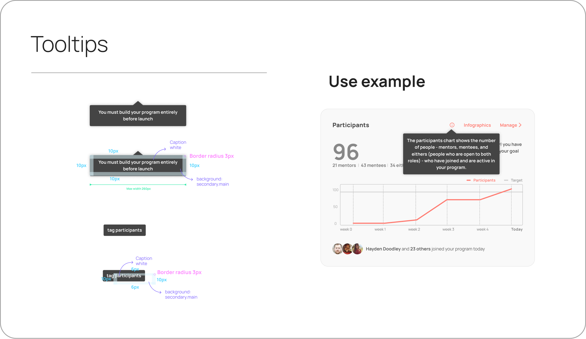
Building blocks like buttons, tooltips, and avatars were aligned with the design system and integrated into the user interface, ensuring consistency in style and interaction across different components.

Mentorloop's design system - Buttons
Mentorloop's design system - Tooltips
Mentorloop's design system - Avatars

Molecules
More complex UI elements, such as dialog cards and banners, were also incorporated following the design system's guidelines to maintain a unified and consistent look and feel.

Mentorloop's design system - Avatars
Mentorloop's design system - Dialog
Mentorloop's design system - Banners

Collaborations and handover

Developer Guidelines and Collaboration
‍As developers had limited access to the developer mode in Figma, detailed developer guidelines were prepared to ensure smooth handoff and implementation. This collaboration also involved creating design elements like graphs based on the chosen development library and defining the behaviour of various UI components to match the technical requirements.

UI notes and guides for the development team

Collaboration with the Marketing Team
Throughout the prototyping phase, I worked closely with the Marketing team to refine the copy and improve feature names to better align with the brand's voice and user expectations. For instance, the term "alerts" was refined to "insights" to convey a more positive and supportive message, while "stories" evolved into "highlights" to emphasise key moments and human connections in the program

Logic and other features

Logic Development for Key Features
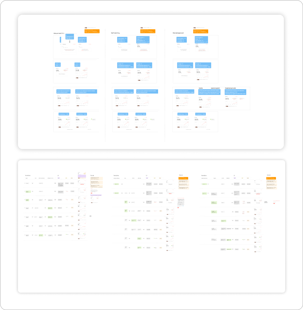
The Insights and Highlights features were meticulously defined, including both their behavioural logic and UI components. These features played a crucial role in providing positive feedback and actionable insights to enhance user engagement.

Insights and highlights logic and UI - This image has been deliberately uploaded in low resolution to maintain confidentiality.

Other features

Exportable Report Feature: A comprehensive Export Report feature was introduced, allowing Program --Coordinators to effectively demonstrate their program’s success to stakeholders. This feature was designed to be flexible and adaptable to different reporting needs.

Report overview

Other pages: Elements that were in the dashboard but had a lower importance (eg. Participants demographics) were moved to other pages, so this had to be put into consideration. However, this is out of the scope of this project.

Participants demographics in the Parciticpants Page.

Final UI and User experience

The final UI achieved a clean and polished look that aligned with the brand's aesthetic and usability goals.

Testing

The effectiveness of the designs was corroborated through various methods:

Demos by Sales and Customer Success Teams: The prototype was presented during sales pitches and check-in calls with Program Coordinators. This approach led to positive feedback from potential and existing users.

Positive Feedback from In-App Surveys: Both existing and new Program Coordinators provided encouraging qualitative feedback through in-app surveys, reflecting satisfaction with the new features.

Stakeholder Feedback: The stakeholders expressed positive feedback and acceptance of the new design, which further validated the success of the design decisions.Improved

Usage Metrics after launch: The data showed an increase in overall engagement and the consistent use of newly introduced features, demonstrating their value and relevance.

Reflection and future outlook

The new dashboard significantly enhanced usability and overall experience for Program Coordinators, providing a clear, contextualised overview of their programs while also highlighting the human component of mentoring

Key Learnings and Potential Improvements

Despite having direct access to our clients, finding the right users for usability testing proved challenging, particularly within tight timeframes and project deadlines. In hindsight, conducting usability testing with users who were an approximation of Program Coordinators would have been more beneficial than conducting limited testing. Tools like Maze could have been leveraged to gather additional feedback and insights efficiently.Another interesting learning was the fact that we did not created Personas, but instead referred to the users as Program Coordinators during the entirety of the project. Perhaps it would've been beneficial to consolidate all of the data and assumptions into a Persona (or Proto-persona) in order to have a more user centered approach.

Future Enhancements for the Dashboard

Post-launch, continuous monitoring and iteration have been crucial in ensuring the dashboard evolves in tandem with the rest of the platform. Here are some updates made to the dashboard post-launch:

Improving the milestones graph by distinguishing between Mentors and Mentees.

Adding Insights to the milestones feature, enabled by the redesign of the Participants' milestones.

Expanding Insights with features like "Share on LinkedIn" to foster community engagement.Highlight the number of Group Matching (which is different from the 1:1 matching) as it is more relevant for some programs.

Thanks for reading